

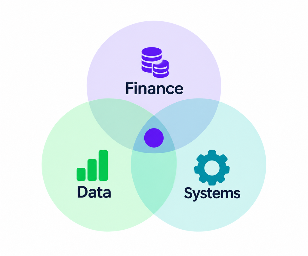
Finance – Data – System
The margin dashboard is ready. Then someone asks: “Why doesn’t this match last month’s number?”
What does this number mean? Where did it come from? Why does it differ from the other one?
When those answers are clear, a dashboard becomes more than something attractive to look at. It becomes information people can use.
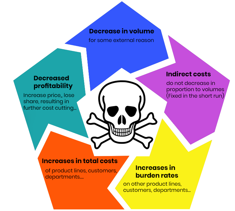
The Death Spiral of Cost Cutting
Imagine a flight from Brussels to Nice in November. The plane isn’t full. On paper, the route is losing money. So the airline’s leadership asks the obvious question: should we cancel it?
If they do, they save on fuel, catering, and ground handling. But the pilot’s salary still gets paid. The lease on the aircraft doesn’t disappear. The gate fees continue. Cancel the flight, and those costs don’t vanish — they get redistributed across the remaining routes, making them look worse than they did before.
This is how cost-cutting spirals begin.